Tuesday, May 31, 2016

P3 PROCESS

I don't have a clue who I would make this infographic for, but my mission statement would definitely involve raising awareness to the general public about the negative and harmful affects of animal agriculture on the industrial scale. I would promote the data that is involved with the footprint of agriculture in a comprehensive manner. This infographic will be interactive.

RESOURCES

This video shows the negative affects of animal farming has on the natural habitat and the global scale effect of the footprint it leaves behind.https://www.youtube.com/watch?v=QzJN0q-DUVc

This link has various extensive infographics concerning the raw numbers that involve animal agriculture and its impact. http://www.seametrics.com/blog/agriculture-infographics/

The third link talks about the cost cost of farming and the impact it has on our health. http://www.onegreenplanet.org/news/infographic-whats-the-cost-of-factory-farming-on-our-health-and-environment/


Project 3: Process

IDEAS:

1- My first idea is to do a visualization of every countries military population count of naval air and land warfare fleets and capabilities. This would make an interesting viewpoint of where countries stand in the event of a third world war. In terms of shear numbers.

2- My second Idea is to a do a data visualization of all the deaths through out the globe from all major wars since WW1. This would specify the total number of deaths per war and the countries.

3- My third idea is to do a data visualization of all the leading countries that contribute to green house gases emited from animal agriculture. Animal agriculture is the leading cause of green house gases in the world.

Unit 6 Reading

Designing for a wide audience can be very difficult because it involves a tedious process of democracy. Various stages of the project needs to be clearly articulated in order for a coherent critique from the team. Among a few other practices that must not be thought of as unnecessary, but as vital or mandatory. Testing your design with your target audience greatly increases the validity of your design when it succeeds amongst your peers. If there aren't any available people to volunteer, you can design a test survey online via email or PDF's. Getting individual reactions however will require a one on one session with your test subjects. This is probably the best option because people will be more willing to be honest without the fear of backlash from other focus group members.

A one on one with a test subject has the most comprehensive results in terms of feedback. These newly underlined points of interest in your project should now be incorporated into your design process. Apart from the research involved, this eliminates having to make design choices on your own and in the dark. Moving forward every decision will be affected by the input you received from your test subjects with improved intuition among your creative peers as well.

The second reading talks about the relationship a public space has to an entire world of people that visit. The story that connects all of us must be conveyed in such a manner as to keep in mind the emotional trauma that is connected with the designed space. In this case the world trade center memorial with a strong dynamic of people. The story was within them on that day. They were fire fighters, Police, and Family Members that to me represent NEW YORK itself. The memorial needed to follow that narrative without generalizing the millions of lives that and families that have been affected by the event.

Sunday, May 15, 2016

UNIT 5 READING

As a graphic designer, the most essential thing apart from your knowledge and talent, is time. The factor that determines the success and failure of a projected can be undermined if the time you have allotted to you isn't used accordingly. For the sake of time and money there are practices to help ease the problem, which therefore has a more meaningful and impactful result at the end when the design is finished. Things like site maps, wireframes, along with an involved and critical team, create the base for the project to stand on. Thus increasing the chances of success of the design project.

Sitemaps are probably as bare bones as it gets when it comes to laying out our content. It's purposes tend to cater to the web and its applications, but because of its structure, it allows large amounts of information to be semi organized. At least at this stage you know what content is going to be applied and also creates a space for team members to collaborate and iterate further. The end consensus among the creative team will be the backbone of the project.

Assuming of course there are factors that interweave with this creative process. Things like the client background, story, target audience, problem and solution, are all just as essential as the design itself. Within the reading there is an example used of the old WINCHESTER house. The house was built without a foundation of planning and they didn't know what they were building from one day to the next. The house is an absolute maze and there are many hallways, doors and stairs that lead to absolutely nowhere. This metaphor is used to describe a designer that doesn't consider the importance of the project statement, but carries out the project. Later the designer is faced with mistakes, and questions that will be forced to wrestle with complex files and information.

Later in the chapter wireframes are explained to help organize the actual content. These are also very simple interpretations of the final product. But it will at the very least give the design team an idea about the general layout, and subheads and if there any questions of confusion, the consequence isn't so much as a sketch to iterate.

Wednesday, May 11, 2016

WEEK 6 CRITIQUE

Critique group: Kan, Sovanarath , and  Bair, Lex

For my critique this week I got a lot of good feedback about the research that I had accumulated, but there were still some kinks work out. Luckily, I did end up feeling exponentially more confident about the direction of the project. I am going to have to change my project statement but the scope of the project is goingg tobe much clearer, here goes.

For my data visualization project, my client will be FORMULA1.com. This is where the project will be displayed as a post season article for Lewis Hamilton and his 2008 season in which he won as the then youngest driver in the formula one driving league. The data visualization will include an introduction of Lewis Hamilton about hs career stats and achievements, following below will be a menu of icons  that will each represent the track hosted during the season. In all there are 18 tracks, and along with an interactive function I'd like to display the race results for each race.

DATA SOURCES
2008 SEASON


AUSTRALIAN GRAND PRIX RESULTS


Tuesday, May 10, 2016

Project 2 Process Pt 2

Project Statement:

Lewis Carl Davidson Hamilton, (born 7 January 1985) is a British Formula One Racing Driver from England, currently racing for the Mercedes AMG Petronas team. He is the 2008, 2014 and 2015 Formula One World Champion.In his first season in Formula One, Hamilton set numerous records while finishing second in the 2007 Formula One Championship, just one point behind Kimi Raikkonen. He won the World Championship next season in dramatic fashion, becoming the then-youngest Formula One world champion in history.

At the Brazilian Grand Prix, Hamilton needed to finish at least in fifth position if Massa won the race to secure the World Championship. In mixed conditions, Hamilton became the youngest Formula One World Champion as he snatched the championship on the very last corner. Just before the race began a rain shower hit and Hamilton ran in fourth place before dropping down to sixth to put on dry weather tyres. Hamilton had clinched the 2088 formula one racing championship, becoming the youngest driver to win the title, as well as the first black driver. He is also the first British driver to win the World Championship since Damon Hill triumphed in 1996.

The Official Formula One Racing website will be releasing an article of the Brazilian Grand Prix Post Race standings along with a commemoration of Lewis Hamilton's epic win and an in depth look at specs and achievements.


Sunday, May 8, 2016

UNIT 4 READING

We are immediately introduced to a seemingly confusing and cumbersome infographic. With its interactive properties you click through all the countries and you realize the alarming numbers of debt that bigger countries have among the rest, than the smaller countries like Greece. You immediately see the political connection and it actually upsets me, to applaud the designer. The connection among all the countries shows how little room there is for money to move around before it loses its value. Then you realize that the debt of money is irrelevant when you think of the millions of lives that are at stake. This Infographic does a good job depicting the problem although I admit there was some effort on my part to dissect the information at first hand.

The quality of relationships designers choose to articulate a subject rides either success or failure. We must always seek to tell the story without confusing people. The information is already confusing. Instead in service, we as designers, seek to make it relevant without losing the point. This form of communicating is important because of how it transcends all levels of a functioning society. The design must be a catalyst to the information that is empowering the reader. In an engineering situation specifically, lives are at stake. It could also mean the difference between lawmakers and legislators being able to pass crucial bills that may help society. We immediately see the consequences in one of the power points narrated, that the astronauts perished because analyst pledged to a committee a useless and vague powerpoint that ended up costing human lives.

Throughout the article you are shown various infographics and we are explained how designers can render information meaningless if applied incorrectly. How we must try our best not to adhere to the social expectations of the internet. The end result may be visually appealing while ignoring the purpose of the design in all its complexity. Infographics serve society in a way that we are hard wired in the brain visually and take advantage how we draw relationships from what we see.

Project 2 Process

IDEA 1
Lewis Hamiltons'  2008 Brazilian F1 Grand Prix win to clinch the seasonal championship as the youngest F1 racer to win the title.This race imparticular has been noted as the #1 most epic race because of how close the race was down to the last lap, to the last corner. The weather was almost impossible to predict and tires were switched from wet to dry alternating throughout the race costing critical seconds on the clock. Throughout the season Hamilton had been plaigued by penalizations but ultimately he would emerge victorious on the score board. Until the last and final race, Hamilton only needed to finish in 5th place to clinch the title.

I would like to observe Lewis Hamiltons last race at 2008 Grand Prix in Brazil to go with a magazine but i have not settled, and i am looking for appropriate media for the infographic

Infographic Example-bottom of page


IDEA 2-
My second idea is to observe the boxing stats of mexican boxer Saul canelo alvarez. His current record is 47-1, sucumbing only to Floyd Mayweather. Recently Canelo Alvarez has dominated over opponent Amir Khan. I would like to do a promotional poster about Canelos' fight with Kahn and career percentages.

Compubox Historical Review

Canelo & Amir Stats and info preview

IDEA 3-
My third idea is to do a data visualization of the shear power of nuclear weapons using scale and energy graphs. This would be a cool article to go along with a NewYork Times article depicting worldly  conflicts such as the likes of North Korea or whatever ISIS got their hands on a nuke in the black market.

Atomic Data Visualization

New York Times Article


LUCKY WINNER....

I think that all three ideas are pretty strong in terms of being able to visualize data. But I think I'm going to choose the Formula Racing project. I am the most familiar with the racing topic because I play a lot of Gran Turismo and I also share the desire to shed seconds off my lap time every run.

PROJECT STATEMENT

Lewis Hamilton has had a very sucessful career racing for Mclaren. Ambitiously being adopted by the racing company at a very young age, he has made an impact on the professional racing league as becoming the youngest champion in the 2008 season.Focusing on Lewis Hamiltons' 2008 career stats and the final Brazil Gran Prix, Id like to do a data visualization for the F1 official website.

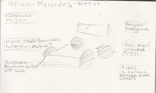
McLaren_MP4-23

Lewis Hamilton Career

2008 Formula Season

CLIENT
FORMULA1


Saturday, May 7, 2016

Unit 3 reading

This chapter has a very interesting way of explaining the uses and purposes of case studies, along with some advice on how to push your research further In order to get a more substatial case study at the conclusion.
Throughout the chapter, it is explained how case studies are used as a means to communicate clearly with a creative team, and helps to guide and refocus the creative efforts into the main points depicted in the beginning . This helps minimize the amount of wasted effort and maximizes productivity. 
Further practices such as user personas are essential to the creative decisions and considerations that take place during the creative process. Figuring in additional minor but critical details about the people using your clients product such as their needs and habits, exponentially increases the chances of success.
In the WHITE RHINO case study, we see and understand a demand for visualizing large sums of data. The benefit seems to be alot more relevant at a second glance than one may think. We also get some insight on choosing the right Cole palette for the data visualizing. How it controls the way information is absorbed. To easing the collective experience in finding the right information.

Data Sources

Formula One Race Time

Pro Boxing Stats

Usain Bolt Racing Stats

WEEK 3 PEER CRITIQUE

Friends:Lettisia Scarlett Gianti Toha and 
For my peer critique, my sense of direction still was not not clear amongst the group, and I was advised to go back and think a little bit more about what I was doing or how I was going to tackle the project. I had already decided that I wanted to focus on the Playstation VR as an infographic but my client and application weren't yet clear. The next day I attended Scotts' workshop in the late afternoon for some further insight on my process.

We discussed a few key points about what I can do to  with the project for the sake of having a more critical critique. The first thing Scott pointed out that, even though that I had decided on the medium/client. I still hadn't taken enough steps to make it the apparent or obvious to the viewer. 

The content that I had laid out was good but more needed to be done so that the text boxes have more breathing room and that my title needed to be more prominent. Further research on magazine layouts from the client were suggested, to gain further inspiration.